
Brand Story (Proposal Version)
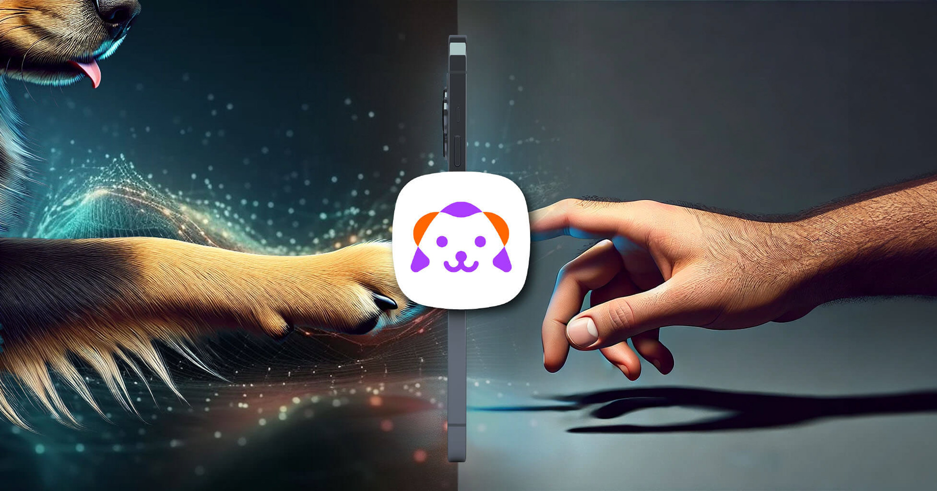
A Comprehensive Pet Care App
Memoark is an innovative brand launched by Samoi, under the leadership of its CEO, Hank Lee—affectionately known to his friends as “Xiao Hao.” A visionary and creative leader, Hank has guided Samoi from the ground up, quickly gaining a strong foothold in the market. Memoark marks the company’s expansion into the emerging field of pet remembrance, aspiring to become an ark of love and hope within people’s cherished memories.
Brand Naming: A Resonance of Memory and Hope
During the naming process, Hank and I brought different perspectives and sources of inspiration. Hank has always had a deep fascination with the concept of the “desert”—not only because his company Samoi (which carries the meaning of “desert fish”) has achieved remarkable success under that theme, but also because the word has become a part of his entrepreneurial identity. To him, the desert represents exploration and limitless potential—an expression of his aspirations for the brand’s future.
In contrast, I hoped to infuse the new brand with fresh elements and emotional nuance. That’s how the name “Memoark” came to life. It merges “Memory” and “Ark,” symbolizing deep remembrance for beloved pets and loved ones, as well as hope for the future. Hank embraced this concept wholeheartedly. Our exchange of ideas sparked something meaningful, breathing new life and emotional depth into the brand.
The Collaborative Journey
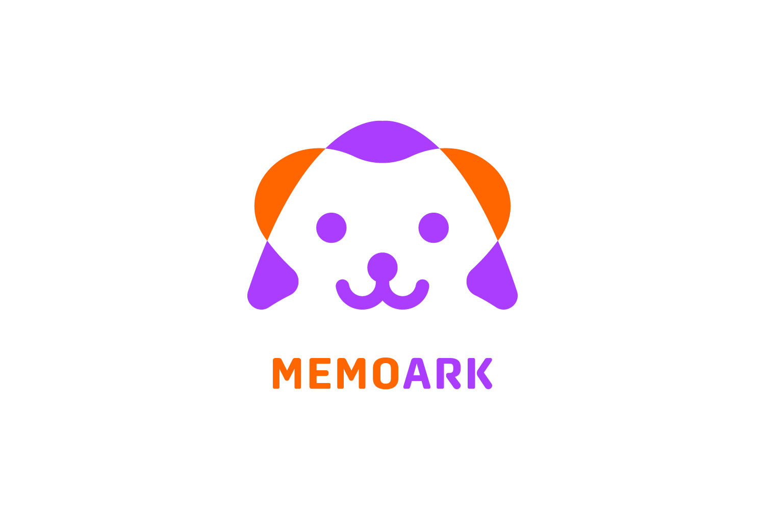
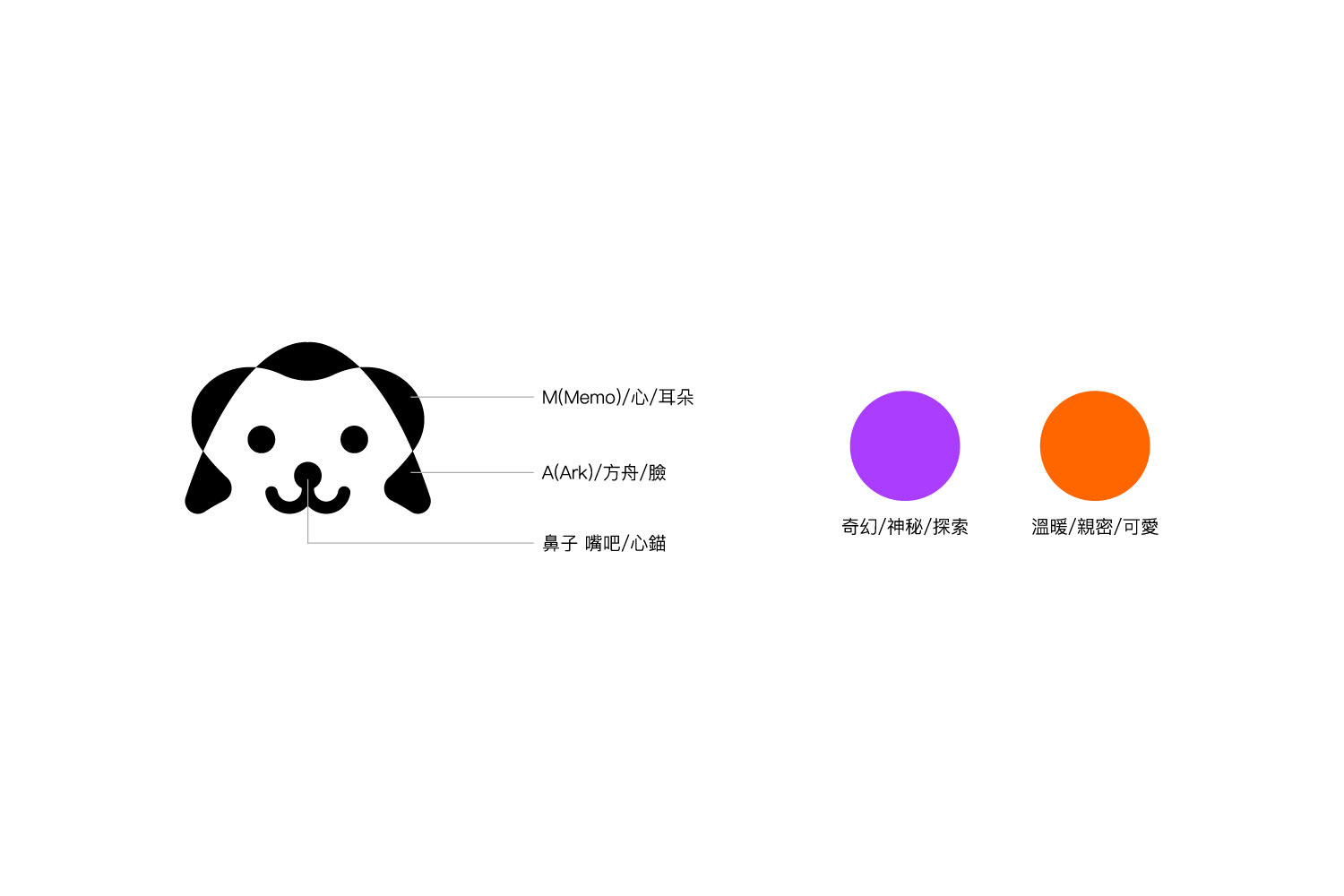
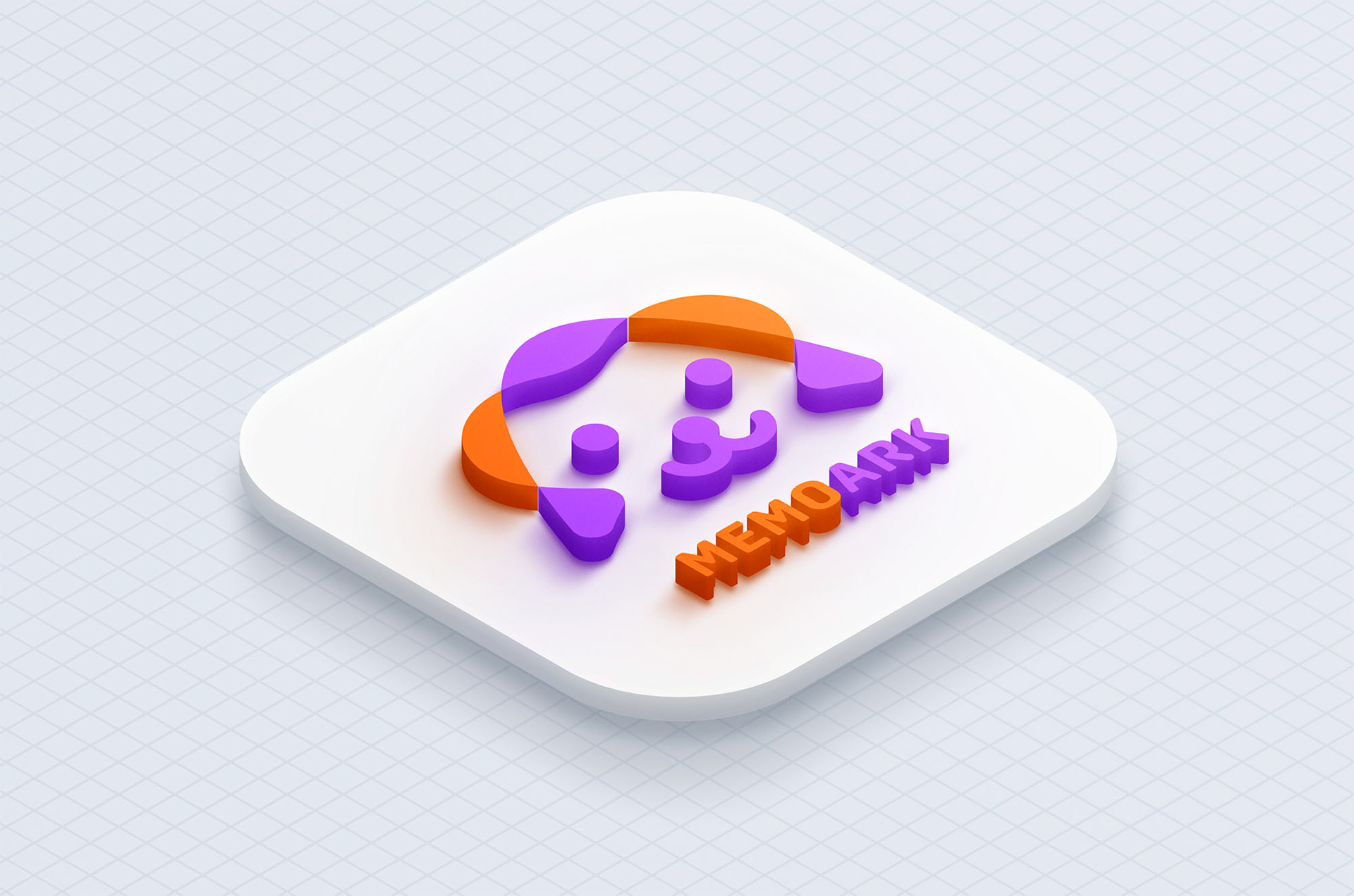
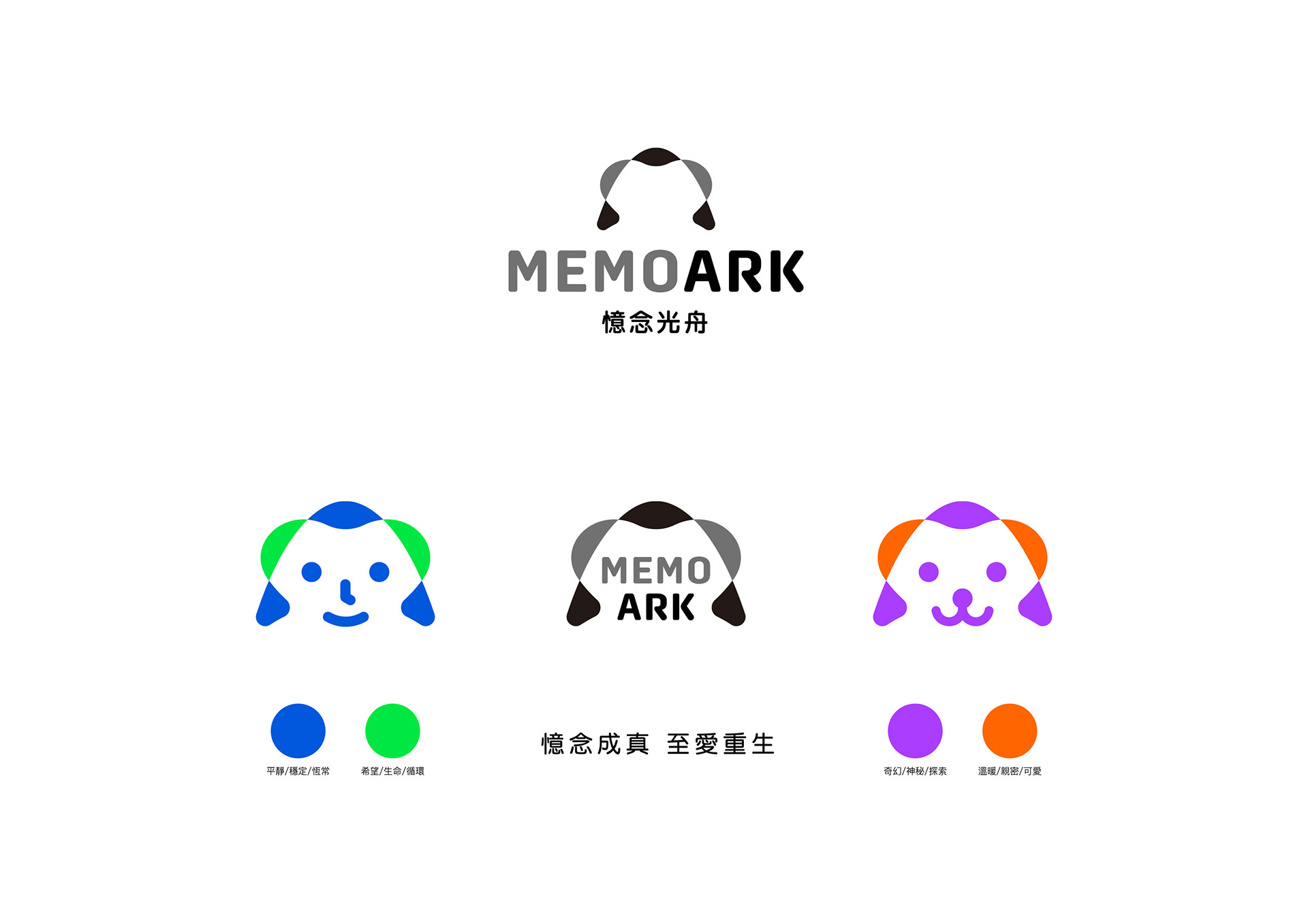
Designing the logo for Memoark was a creative and collaborative journey. I fused the “M” and “A” from Memoark into a single symbol that resembles both a heart and the bow of an ark—representing the meeting point of love and hope. Throughout a series of remote discussions, Hank and I continuously refined the logo’s details, from its lines to its colors. Every step was thoughtfully considered.
I chose a teal blue-green to symbolize serenity and healing, while orange brings warmth and remembrance. Each element in this design reflects the shared thoughts, intentions, and creativity that emerged through our collaboration.
The Power of a Slogan
“Where Memory Becomes Life, and Cuteness Reborn” (Chinese original: 憶念成真 可愛重生) was the creative slogan I proposed from the very beginning. Its simplicity captures the core spirit of our brand and perfectly conveys the emotional resonance we hope to bring to our users.
When I shared it with Hank, he immediately resonated with it, saying it captured Memoark’s brand essence completely. This kind of creative spark deepened our sense of alignment and made the entire brand story more cohesive, heartfelt, and memorable.
Connecting Remotely, Creating Together
Most of my collaboration with Hank took place through phone calls and Line. Although we live in the same city, our respective work environments made this form of communication more practical and efficient for us.
Hank and I have worked together for over five or six years—since the founding of Samoi—and I’ve continually supported him in solving various brand design challenges. Memoark represents the latest chapter in our ongoing creative partnership, filled with fresh opportunities and design-driven innovation.
The Evolution of the Design
After I completed the initial logo design, Hank brought the concept back to his team for further evaluation and to discuss possible directions for the next stage of design execution. During this process, new ideas and suggestions emerged. Some came from business partners who felt the logo could have a more “trendy” or contemporary vibe, while in-house designers proposed alternative takes on the color palette.
These discussions reflected the richness of the creative process—how diverse voices can bring new perspectives and possibilities. While I had some reservations about the proposed changes, I understood this was part of a larger, collaborative journey. In the end, although the final logo shape was modified, my contributions—the brand name, the slogan, and the use of orange as a core accent—were retained. This recognition meant a great deal to me and affirmed my meaningful role in shaping the brand’s identity.
A Milestone Half-Made: Trust in Co-Creation
Even though the final logo that went live wasn’t the original version I had envisioned, I continue to fully support and admire Hank’s decisions. In the world of startups, every decision and shift requires courage. Each revision is a step toward refinement. I’m proud to have contributed my creativity to this process, and I feel a genuine sense of fulfillment seeing Memoark successfully launch.
It was a shared accomplishment—one born from mutual effort and a belief in what this brand could become.
Looking Ahead: Exploring More Together
Memoark’s story is still unfolding, and its future holds endless possibilities. I believe this brand will grow into a meaningful emotional anchor for many, serving as an ark that carries love and memory forward.
I look forward to more opportunities to collaborate with Hank and explore even broader creative horizons. Our design journey is more than just a pursuit of aesthetics—it’s a testament to the trust and support we’ve built along the way.
Memoark Official Website / Key Media Coverage